The filming process has started and we have figured out all of our setting and have all our props together. Today we have discussed who is going to be filming each part and what the other group members have to be doing as we are filming. Today Olympia is going to be filming the scene where Kerry is scared and looking around as if someone is there. Rasheda is in charge of doing the make-up and Fergie is going to be direcing.
Our teachers have showed us in our first year of college how to set up filming equipment and we have to set up by ourselves.
The roles that Fergie is in charge of today is setting up the scene and telling Kerry how to look.
Tuesday, 26 October 2010
Monday, 25 October 2010
Filming Process.
We began filming as soon as we had finished our Storyboard and gathered our props. In order to film we had to book a camera from the media area a week before, in order to do this we had to fill out a booking form in which we had to answer all the relevant questions; we had to say where the equipment was to be used and who was using it and also we had to talk of the dangers involved and how we going to prevent any accidents happening when using the equipment (this is important for our safety and the safety of the equipment).
The first thing that was had to do once we had all the equipment was to set it up. We had lights, a tripod, a video camera and a still camera also. Setting up took approximately 20-25 minutes (a lot longer than we expected).
The first thing that was had to do once we had all the equipment was to set it up. We had lights, a tripod, a video camera and a still camera also. Setting up took approximately 20-25 minutes (a lot longer than we expected).
 |
| We put the lights in a certain position depending the shot. |
 |
| We had to make a scrap board as one of our props. |
 |
We had to put the scrap board correctly into the light. |
 |
| These lights are very powerful a create a good image on camera. |
 |
| Our Scrap board looked well lit because of the light. |
We had our shooting script out so that we were able to know what we had to shot and how long for, this came in very handy as we couldn't remember everything.
The first thing that we shot was a doll that we were using as a prop, we had to do a close up of her face out of focus and then slowly come into focus. We attempted this shot about 6 times just in case, but also the camera kept on shaking as we changed the focus, even after this the shot still wasn't good enough qualilty so we done it again but about 9 times and we finally found one that was good.
Sunday, 24 October 2010
Prop Production Work.
 In the development towards our progression to our teaser trailer we wanted to create a successful range of props that would show a visual outcome of the idea that was produced in our storyboard.By taking into account the trailers genre and our own visual idea props were produced by the use of mix media, to create a professional effect. Being the graphic and creative designer of the group i produced a range of designs that will be used for the role as props.The development and finished design effects were produced by using the computer software Adobe Photoshop Elements.
Adobe Photoshop Elements is a consumer version of the Adobe product, Adobe Photoshop.I chose to use this particular software because it is designed to edit photographic images and targets photography enthusiasts in the design industry. Adobe products are predominantly focused upon the creation and production of multimedia and creativity software of products to enable a diverse range of designers such as, Graphic Designers, Illustrators, Web Designers, Game Designers and Photographs to produce and edit designs.
 Up above is a screen shot of the computer software in action, visually the software shows similarities of Adobe Photo shop.The software contains most of the features and designs of the professional version.The software is designed to focus on photographic elements so extra and new addition settings and features have been added to the software which will be a benefit to a photographic designer.The programme allows designers and consumer users to create, edit, organize and manipulate images all form the same product.I used this software to edit a combination of digital photographic images, to be produced into Polaroid images by using my graphical skills.
In correspondence to our teaser trailer it was my role to produce our groups visual idea for our props.The first group of video shots of the teasers sequence will consist of a number of close and extreme close up shots of a billboard.The billboard in the teaser trailer will represent the atmosphere of a psychological obsession that is evident throughout the trailer.The billboard will contain a number of Polaroid and typographic images which will represent the psychological escalation towards the female victim.They will also emphasize the villains psychological state of mind resulting into the demand for accountability of the victims daily actions which is visually represented by the Polaroid images.
The above shows three photographic images being edited into Polaroid images.All three images were edited in the same way by using and producing graphical elements to transform the images into Polaroids.The first stage of editing the image was to adjust the brightness and contrast settings of each of the three images, this then created a sharp effect on each of the images.The second stage of the process was to create the photographic paper effect around each of the images.This was done by creating a white background layer around each of the photographs producing the effect.The final stage of the process was to transform the images sizes so that they would fit into the composition of the white layer which shows the characteristic effect of a Polaroid image.

Up above is the second screen shot showing the last two images being edited into Polaroid images in photoshop.Both images were edited in the same way to show the visual characteristics of a Polaroid image.The first stage of the editing process was to adjust the brightness and contrast settings on both of the images, the result of this effect created a sharper look upon each of the images.The second stage of the editing process was to create the effect of the Polaroid photographic paper.This was created by producing a white layered background in an open file as the bases of the image.The last stage was to drag the adjusted image onto the white layered background, the both images were transformed by adjusting there scale size so that they would fit onto the composition of the white background.This action produced the effect of the Polaroid images.

Up above shows the third screen shot of the image editing process.For our billboard we chose three photographic images of the female victim.All three images have been taken by using a medium close up camera focus.The use of a medium close up shows the subject matter of the female individual in a more detailed perspective, which shows the individuals body language and physical emotions in a closer visual view.Due to the genre of the film i decided to crop each of the images so that the female within the image is the only subject, by the process of editing each of the images in this way will establish to the audience the main focal point within the composition in each of the photograph.All three images had adjustments done to there brightness and contrast setting creating an overall effect of a sharper and more focused image.


Up above is the second Polaroid image created by using photoshop.The second shot shows similarities of the first Polaroid image, the similarities can be visually seen by the subject matter being photographed at a far distance from the camera lens.This technique will reinforce to the audience the obsessive attention that is being active from the villain character.The image was taken in a long shot perspective, which shows an urbanised street view.When designing the Polaroid images i decided to take a variety of photographs that shows normality that most people can relate to in there lives.The audience members will be able to have a relation to the activity that has been photographed, for example the shots of city streets and transport our a part of persons routine.
 Up above is the third Polaroid image created by using photoshop.The third Polaroid image continues the theme of unwanted obsessive attention.The third Polaroid image continues the same photographic technique of photographing the subject matter at a far distance away from the camera lens.The third image shows a long shot/establishing shot of an high developed city location, this can be visually identified by the modern architecture structures of buildings and transport.Again here i wanted to reinforce the ideology of normality that can be related between the surroundings and location and the audience members.Here again i continued to reestablish the visual idea of a rapid escalation of obsessive attention which is being active from the villain character.The image of the train within the composition shows the psychological escalation of there unhealthy attachment towards the victim character, the fact that the villain is photographing parts of the victims daily routine creates the overall effect.
  Up above is the fourth Polaroid image created by using photoshop.The Polaroid image still continues the conventions of the previous Polaroids, by photographing the subject matter at a far distance away from the camera lens reinforces to the audience the idea of unwanted obsessive attention.The third image shows a public walkway that is attached to a building.I chose to take a long point of view shot on a right sided angle, by capturing the image in this perspective i was able to frame the individuals at the far end of the shot, which in effect shows the obsessive actions active from the villain character.Again here i wanted to enforce the idea of normality within the image, the image can be identified in a variety of personal visuals.For example audience members may relate the image as part of an educated building, or some audience members may just visual the image as a normal public footpath.The image again visualises the psychological escalation of the villain character by photographing parts of the victims daily routine. .
 Up above is the fifth Polaroid image created in photoshop.Here again i reinforced the idea of obsessive attention by continuing the conventions of the previous Polaroids.Here i took a photograph of an urbanised area located in a city.Here again a long shot was used to emphasises the background and the subject matter within the composition.Here again i continued the conventions of the previous Polaroid images, by photographing the subject at a far distance away from the camera lens reinforces the idea of obsessive attention being active within the Polaroid image.Here again i wanted to enforce the idea of normality within the captured image and photograph a subject that audience members can relate to in there individual lives.Here a city road was photographed capturing a a number of vehicles in a traffic jam.The normality of the pictures enforces the idea of the psychological state of mind the villain character is in.This picture again shows the escalation of obsessive attention active from the villain character.

 Up above are three photographic images of the victim character.All three images have captured the victim in a medium close up.The technique of capturing the actor in a medium close up equalizes the composition of the image, giving a more detailed visual of the subject matter in the frame.All three images distinguish the victim character by the use of a medium close up.All three images don't show the victim in a broad context of the background surroundings, due to the fact that the audience will be uncertain of what the focal point of the image will be, here the use of a medium close up establishes to the audience members that the female within the frame is the focal point of the image.
 Here again the idea of obsessive attention is established within the photographic images.All three images feature the same actor which will establish to the audience that the actor featured on the billboard will be featured within the teaser trailer.All images have a huge importance in signifying to the audience the escalation of obsessive attention being themed around this particular character..
 Up above are two screen shots of the designing process in relation to our prop production work.As the graphic/creative designer of the group i had to produce a range of design products that will be used as props for our teaser trailer production.It was my role and duty to produce props that would show our visualisation of what we wanted to interpret into our teaser trailer.In correspondence to our teaser trailer i wanted to show a visual representation of obsessive attention, when designing story board we as a group decided to feature a billboard that would represent a shrine of obsession of the victim character, to be featured in the beginning of the footage of our teaser trailer.The billboard will feature a number of typography elements which will represent news paper headlines.
Up above are two screen shots of the designing process in relation to our prop production work.As the graphic/creative designer of the group i had to produce a range of design products that will be used as props for our teaser trailer production.It was my role and duty to produce props that would show our visualisation of what we wanted to interpret into our teaser trailer.In correspondence to our teaser trailer i wanted to show a visual representation of obsessive attention, when designing story board we as a group decided to feature a billboard that would represent a shrine of obsession of the victim character, to be featured in the beginning of the footage of our teaser trailer.The billboard will feature a number of typography elements which will represent news paper headlines.Each headline will represent the dangerous situation the victim character is now present in.They will also represent the escalation of the obsessive actions active from the villain character.As the graphic designer i used a specific technique of arranging and styling of typography.It was important for me to use the conventions of a professional newspaper, so audience members would be able to recognise what the typography design elements are on the bill board.I decided to use a bold font in the style of "Tahoma" each character of font was used in capital letters, to show the importance of the typography and also to follow the professional conventions of a newspaper tabloid.  Up above shows a photographic image of the finished billboard designed for our teaser trailer.The billboard consists of Polaroid images, images of the victim and tabloid headlines all designed and produced in the computer software photoshop.The billboard is the dominant feature within our teaser trailer to establish to the audience the genre of the film, it will visually represent the psychological escalation of obsessive attention played from the villain character.All the elements attached to the billboard have there own individual role of showing the audience members what situation may occur in rest of the footage of the teaser trailer.All elements featured on the billboard where specifically designed to represent and enforce the idea of obsession based upon the victim character. .
 Up above shows a close up shot of the billboard.This photographic shot shows the arrangement of the features upon the billboard.Billboards are designed purposely to catch an individuals attention and create a memorable impression and influence upon an individual.In correspondence to our teaser trailer we wanted to use a billboard to represent a shrine of obsession based upon our victim character.As a group we decided to arrange the features upon the billboard in a specific way, we decided to place the billboard images around the whole of the surface area of the billboard so that it would automatically catch audience members visual.We decided to write some typography on the Polaroid images to reinforce this idea of obsession.All features on the billboard were wrote on and tone up to give an overall finishing touch effect.
 Up above is the second photographic close up shot we took of the billboard.Here again we wanted to show how we arranged the features upon the billbaord.Here the close up shot shows how we aranged all the elemets within the composition of the billboard.We wanted to overlap and layer the features upon the billboard, this in effect makes it eyecatching for the audience memebers to visualise.All polaroid images and tabloid headlines were position and arrange in a variety of ways to emphasise the representation of obsession.In effect the messyness and the layering of the features will dominate the audience memebers visual when viewing the teaser trailer, which will enhance the films genre and story line.
 Up abouve is a photographic image of the finished bill board.The bill board plays a dominat role in representing the films genre and giving an overall effect and emphasis of the films storyline.All features were designed to enforce the ideology of unwanted obsessive attention based upon the victim character.All features were digiataly created and manipulated by useing the digital software Adobe Photoshop Elements.The digital software enbeld me as the graphic/creative designer to produce a variety of features/props that would visually represent what we wanted as a group to interpret into our teaser trailer.The software enabled me to create the features in a professional mode giving them the characteristic and conventions of professional photographs/tabloid headlines which will encourage the audicene to think they are real elements/features.
Up above shows a photographic image of the finished billboard designed for our teaser trailer.The billboard consists of Polaroid images, images of the victim and tabloid headlines all designed and produced in the computer software photoshop.The billboard is the dominant feature within our teaser trailer to establish to the audience the genre of the film, it will visually represent the psychological escalation of obsessive attention played from the villain character.All the elements attached to the billboard have there own individual role of showing the audience members what situation may occur in rest of the footage of the teaser trailer.All elements featured on the billboard where specifically designed to represent and enforce the idea of obsession based upon the victim character. .Up above shows a close up shot of the billboard.This photographic shot shows the arrangement of the features upon the billboard.Billboards are designed purposely to catch an individuals attention and create a memorable impression and influence upon an individual.In correspondence to our teaser trailer we wanted to use a billboard to represent a shrine of obsession based upon our victim character.As a group we decided to arrange the features upon the billboard in a specific way, we decided to place the billboard images around the whole of the surface area of the billboard so that it would automatically catch audience members visual.We decided to write some typography on the Polaroid images to reinforce this idea of obsession.All features on the billboard were wrote on and tone up to give an overall finishing touch effect.Up above is the second photographic close up shot we took of the billboard.Here again we wanted to show how we arranged the features upon the billbaord.Here the close up shot shows how we aranged all the elemets within the composition of the billboard.We wanted to overlap and layer the features upon the billboard, this in effect makes it eyecatching for the audience memebers to visualise.All polaroid images and tabloid headlines were position and arrange in a variety of ways to emphasise the representation of obsession.In effect the messyness and the layering of the features will dominate the audience memebers visual when viewing the teaser trailer, which will enhance the films genre and story line.Up abouve is a photographic image of the finished bill board.The bill board plays a dominat role in representing the films genre and giving an overall effect and emphasis of the films storyline.All features were designed to enforce the ideology of unwanted obsessive attention based upon the victim character.All features were digiataly created and manipulated by useing the digital software Adobe Photoshop Elements.The digital software enbeld me as the graphic/creative designer to produce a variety of features/props that would visually represent what we wanted as a group to interpret into our teaser trailer.The software enabled me to create the features in a professional mode giving them the characteristic and conventions of professional photographs/tabloid headlines which will encourage the audicene to think they are real elements/features.By Kerry Treacy
Prop Preperation Research.
 |
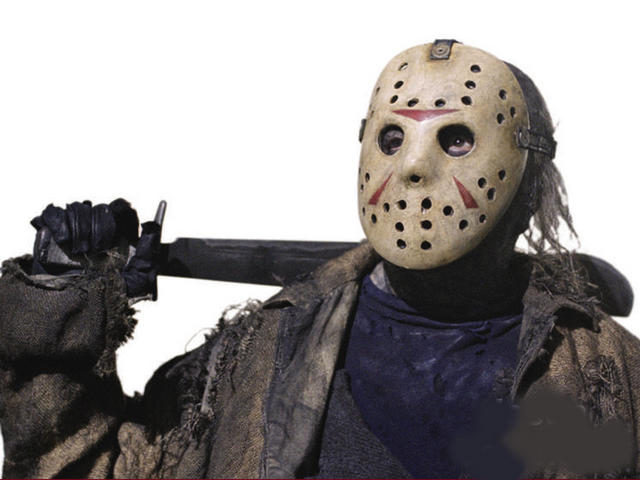
| Halloween |
Here we looked at the conventions of a horror film and we researched the types of props used. This is a picture of the 'villain' from the film ‘Halloween’; he has a knife in his hand. He is holding the knife with a tight grip, giving the impression that he is going to stab somebody; this is very effective way of building suspense with out actually seeing anything happen.
 |
| Tight grip. |
We then went on and researched more about knifes and in most horror films the knife is held in this way because it is more intimidating and can do more damage to a person when held like this.
Also we researched on how to make our dolls look scary as that was the effect we was looking for. We discovered things like; Headless dolls, Bloody dolls and dolls that were old but perfectly beautiful. Also clown type dolls can be used to scare. These types of toys can be used to scare because you do not expect them to be like this.
 |
| Headless dolls. |
 |
| Old doll. |
 |
| clown dolly. |
 |
| Tied Hands. |
By Olympia Amoo.
Friday, 15 October 2010
Consent Form
Before we started any filming we found our actress to play a part in our teaser trailer. Therefore consent form was issued due to the purpose of releasing the final footage of the trailer on YouTube.
Below is a consent form for our actress Olympia Amoo in which she will play the main character as a villain.

Below is a consent form for our actress Kerry Treacy in which she will play the main character as a victim.

Update 15/10/2010
This is our update just before half term.
Our filming progress has begun as we have just successfully completed our planning.
We had managed to finish our audience research where we took all our results into consideration in order to create a trailer that is suitable for our target audience. One question in our audience research, which asked people what horror film the preferred, the audience answered Thr Grudge. As our storyboard and Treatment shows, our trailer is based on a woman who is psychiatrically sectioned, this has already allowed coincidently, allowed us to trap an even bigger audience.
One weakness that we need to stear away from is the similarites of the two films. Fortunately, The Grudge is of a supernatural horror movie therefore, having a more human, reality feel to our film will hopefully challenge horror films with supernatural conventions because Mental Patients do exist as our trailer will portray however, no matter how many supernatural citings are reported, there is still no solid proof.
As a group we have split work commitments on improving the blog during half term. These include research into film production companies and prop preparation research.
By Fergine Nzita
Friday, 8 October 2010
Setting Research.
Setting Research.

From looking at other horror films we can see that the usual setting is some deserted unknown location. This a typical convention as it adds to the tension because it makes you think ‘how are they going to get saved?’. For example the location on the right is not established, we can guess where it is but we don’t know for certain. This location is also very dark and gloomy so you cannot really see everything that is going on there. The fact that it is empty automatically takes away all normality and makes the audience think 'what is happening here?'

This can be compared to our choice of location because we wanted the audience to have to guess where our victim is being held. As you can see, our location only shows bars that look like pipes of some sort; this means that our location could be anywhere.
We wanted our actual location to be a deserted warehouse or a dungeon but it seems much easier to create the effect of a warehouse than a dungeon because of limited resources but I think that location of our choice fits in well with our genre as it is a psychological horror and conventional the villain takes the victim away from everyone.
Thursday, 7 October 2010
Make-Up Research.
The make up for the teaser trailer was carried out by me as I have a keen interest in make up. Fake wounds, and working with fake blood is not my regular type of make up, therefore I had to carry out research on how to make a wound, cuts and scars look real. The kind of effect I was trying to replicate was when a rope cuts an area on the arm and also scars to the face area.
Following the tutorial was easy but the tricky part was making the actual effect look as if it was real. Fake blood is usually watery unlike real human blood which is thick and not watery. The colour depth is also in a dark red tone which had to be adjusted to make it more realistic. I had to make sure not to over do the make up therefore I used the sponge to test on a small area first before proceeding onto a larger area.
I had followed Youtube tutorials to gain knowledge on to create wounds and bruises.
These are some of the materials I had used to create the effects:
1.Scab Tissues
2.Face paint-bruise wheel
3.Fake Blood
4.Sponges
5. Brushes
This is one of the video which I used and helped me to create a releastic bruising.
These are image below also helped me to replicate similar effect. However, I made the look more dramatic with blood dripping from the mouth. This was used on the victim to make the look more dramatic and realistic .


Overall this research has allowed me to learn and develop various types of special effect make-up. Whereby I have learnt new skills and implemented it during the production of the teaser trailer, front page magazine and film poster.
Make-up Testing.
 |
| This make-up is used to create bruising: |
 |
| We first applied the wax and bone wax to create the look of cut skin. Then applied a bit of red to show bruising. |
 |
We gradually made the bruising look more severe and painful by adding more colour to the wound. |
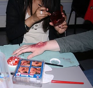 |
| We then added scab tissue to make it look as if the skin has a scab on it. |
 |
| Finally we added the fake blood to it to give the effect of bleeding. |
 |
| This was our turn out. |
 |
| Here we are beginning to make it look as if her wrist has been cut and bruised by rope. We discovered a few mistakes. The bruising is too big and is not spread out enough, we realised that we needed to use a sponge instead of a brush. |
 |
| We used the same process of darkening the bruising. |
 |
| We added some scab tissue. |
 |
| This was how it turned out. We were happy with the turn out, however we need to use a sponge when doing this type of bruising again. |
Costume Research.
Costumes in a conventional horror film will be different to the type of costumes used in an action film. A villain for instance will wear clothing which enhance the look of the bad image they are wanting to have. A conventional horror film will have the villain dressed not to impress but to scare people and get them noticing that this villain is not someone to be messed about with.


Costumes enhance effects of the entire film, audiences expect the villain to be looking as a normal villain will look. People are expecting dull clothing, with colours such as black, Grey, brown and all other colours which are not bright. Costumes need to look different whilst in comparison to the victim
These are images which i have found of villains, Note that how the use of colour and style which can be seen on the villains costumes.
From the images I have added above, it is clearly showing the villain are dressed in dull colours, the costumes contain negative effects whilst looking at the character.
This research has concluded only to one result, and that is to dress the villain unattractive colours and coincidently look more of what a conventional villain will look like. The chosen costume for our villain is a black monk gown. The gown is in neutral coloured with no designs and is to look plain and simple and just send out the message of a bad villain to the audience.
Subscribe to:
Posts (Atom)