Monday 14 March 2011

Feedback:

Q4: please use headings to separate all of the production stages, and so I can see who wrote what. Also- it would appear that the research section of Q4 is not there- who was responsible for doing this part?

Reply to Q4: The Research section was done by me (Rasheda), it was uploaded on the blog, during the half term and did not go on the blog since, other section on question 2 and 3 went missing on my part even though it was uploaded however, it was pointed out by Olympia so I had to re-uploaded my part of the evaluation again.

OK.  thanks for clarifying this-  I assume it is all there now and displaying correctly-  I will check now.

Q3: there were some serious problems with clarity of language here- some incorrect ways of phrasing which you should avoid, such as:
" in the correspondence' this is wrong, please say 'the you tube statistics'
"show and communicate to us' no- re-phase and un-complicate this please.
" male 13-17 year old males'

this section needs to be thoroughly proof read and corrected.
This has been corrected now.
Q2: very good work- well done.


Q1: very good, until the paragraph which begins... " Another convention that was also noticed in majority of teaser trailers was that..." this paragraph demonstrates poor language skills, so needs re-wording.

The sections on the magazine and poster were good- no corrections needed. well done.
Also corrected.
Finally, I need to know who wrote which parts of the evaluation, so can one of you speak to me about this?
Should we write our names underneath each part? or?

you can put your name or names in the blog title or next to the sub-heading (such as planning', or 'production'.  this is probably the clearest way of ensuring that I can assign marks fairly. 

I have looked at the corrections you have made, and I'm happy with the overall standard now.  well done!

Tuesday 15 February 2011

Evaluation Question 4

How did you use media technologies in the construction, research, planning and evaluation stages?

Research (Rasheda Miah)


Throughout our entire media project, media technologies played a vital role when it came to researching our production. In our project we had to produce a teaser trailer, poster, and front page magazine cover, so as a group we decided that every member within the group has to research and write a textual analysis on a range of existing horror teaser trailers, posters and front page magazine covers.
In the analysis we studied how Mis en scene, editing, sound was followed and performed, as well as studying the conventions in the teaser trailers, poster and magazine front cover. We was able to research and find examples of various horror teaser trailers by using the internet to go on websites such as YouTube, as well as going on to cinema websites such as ‘Odeon’ in which the trailers for new releases of horror films can be viewed. It was easy to find a variety of horror genre trailers on the Odeon cinema website as it allows audiences to find film by genre; below is a screenshot to illustrate this and a screenshot of how the YouTube website was used:


An early example of our researching update, where we discussed some of the media technologies that we used is shown on the website link below:
During our research we all looked at a number of horror film posters and film magazine front page by using Google images as well as buying existing magazines from the shop. During the research as a group we used the internet to differentiate between a teaser trailer and a trailer so that we understood the whole aspect of a teaser trailer before we went any further on to the planning our production.
YouTube is a useful and constructive streaming website used worldwide and is very popular. It consists of so many videos that relates to anything you search for, for example, in our group we used YouTube a lot to find out how to create special make up effect by looking at tutorials, we also looked at many horror teaser trailers and used YouTube to share our final teaser trailer video, behind the scenes in which we was able to load on to our blog. As followed on the link below:
Special effect make up was a crucial part in developing our character, shown on the poster, front cover film magazine as well as in our teaser trailer. Therefore make up tutorials shown on earlier post (Make-up Research) enabled us to create a realistic bruise to our character’s eye and wound effect.
We were able to apply our knowledge from what we gained through the research on special effect make-up to enhance many skills. Below are images illustrating the special effect make-up testing in which, one of our group member’s performed during a lesson, when we were given the opportunity to practice on the characters, without any assistant from the teacher. This allowed our group to see the strength and weakness on the special make-up effect so that it can be improved for the production.

As a group we were extremely pleased with the bleeding wound affect illustrated on the right hand side, considering it was a first attempt. However, the bruising on the left hand side was our weakness as the bruise came out too harsh, this is because a brush was used instead of a sponge.
The screenshot below demonstrates how the special effects make-up was used during the production of the teaser trailer and poster and magazine front cover.


Planning: (Olympia Amoo)

Our group decided that it was impotant to practice using the equipment before we use it for real. We practiced all different types of shots including; panning, tracking, long shots, close ups and extreme close ups. We already had our storyboard drawn up so we knew what shots we were going to use and what ones we needed to practice.
It was extremely helpful practicing because when it came to doing the real thing we didn’t need to ask our teacher or Adam for much help. When going over the test shots as a group we were able to see what worked well and also what didn’t. We found that the panning working really well and we wer confident in using that for our trailer but we didn’t really like the turn out of the tilt because it didnt look smooth and you could see the camera shaking slightly.

We didn’t feel as though practicing was a waste of time, although many others thought this because we was using twice the time practicing and filming for real. The advantages of filming test shots was that when it came to filming for real we could get straight on to it and know how to set up the white balance and exposure. We were all taught in class how to change the exposure of the camera and the white balance but if you did not practice at it is was very easy to forget. In order to change these settings you need to go into the menu part of the camera and select the appropriate settings and change it to your preference. We found it to easy to set up the camera and tripod with the aid of Adam or our teacher but we did find setting up lighting a challenge because the equipment is so expensive and fragile, we were scared to damage it, but as we continued to film more we got a lot more confident with setting up all the equipment without any assistance from the staff.
We found that we filmed quicker without the help of our teacher but setting up took longer as we felt quite new to the equipment even after practice. While planning our video we never really used any other media technologies while planning other than the search engines for research.
In the process of planning we watched a large amount of trailers and also studied a lot of magazines and posters. This was why our textual analysis's was so important. We looked at four trailer in depth, four posters in depth and also four magazine front covers in depth. An example of the one that was studied on the left: Empire is a very famous film magazine so we all analysed this magazine brand because it is success for a reason and we wanted our magazine to be like this in order to make it looks professional.

A trailer that also inspired us because all the trailers for the previous movies have been very good is SAW 3D. We liked the soundtrack because it was slow and added a creepy effect so we decided that we wanted something like this too.
Production: (Fergie Nzita)

When we go to the production stages of our media product, the filming process was a spectacular experience for all of us in the group. We had started filming different shots from our storyboard and from this structure, piecing everything together seemed more facile. Our filming process was made even simpler as we were filming inside. If we had decided to do outside shots, the weather would have complicated a little of the process as it is a very big factor and not only that, English weather is very unpredictable so changes might have had to be made quite frequently as that was not a risk worth taking.

When the filming arrangements were made, due to conflicting schedules, we had to analyse our filming times accurately and we decided that production would take place mainly in the production room during lunchtimes and free periods.
As we all had roles in the production stages for example, Olympia was an actress in our media production as well as Kerry, Rasheda was the make up artist, and therefore our first focus was getting the make up ready on Kerry who played our victim. As Rasheda got on with this, outside of acting, Olympia was Producer and Fergine was the director, so this gave us the time to set up the camera and our setting. The camera that we used was a Sony HD Camera which was easy to use with very strong results. The different roles that we had assigned ourselves made the production stage much more effective as we all knew what was needed of us. These roles enabled us to work precisely as our roles covered all areas that were needed in the whole of the filming for our media product.

During our production stages, outside of filming,we had used a Zoom H2 Handy Recorder to record all of our voiceovers, from the crackling voices at the beginning of the trailer to the scary voice at the end saying coming soon which is a typical horror film convention.

When all necessary and needed research was complete we started to produce our own teaser trailer. To film our footage we used a Sony HD camera this was then needed to be equipped with a tri-pod. The tripod was an important piece of equipment that we needed in the process of filming our teaser trailer. The purpose of the tripod was to help sustain and compose a variation of filming and photographic shots. We also used high tech artificial lights for the production of our teaser trailer. Due to the location of our film set it was only most appropriate that we used artificial lighting to enable us to conventionally connote the horror genre teaser trailer through the use of lighting. In correspondence to our filming footage we used a range of composition angles and techniques which would continue the purpose of connoting what we visually wanted to represent in our teaser trailer. We as a group had to use a variety of close up shots which were only appropriate to use due to the fact that we needed to include close up shots of props which had an important purpose to the meaning behind our teaser.
Post-Production (Kerry Treacy):

In accordance to post production it was an important factor that we did some in depth research into the different mediums that would have been required for us to produce our media products. Through the process of creating our media products we explored many types of different mediums and technologies, the purpose of creating our media package was to produce a teaser trailer, movie magazine front cover and a film poster all of which would connotation ally work together and promotionally advertise an upcoming film production. It was compulsory that our media package featured a teaser trailer as one of our main products, we as a group all agreed and thought it was most appropriate that we should spend some time exploring the conventions of a pre existing teaser trailers and visually see what filming and editing techniques we needed to apply to our own teaser trailer production. In addition to this and to broaden our knowledge and understanding of horror genre teaser trailers each individual member of our group produced a textual analysis on a different teaser trailer. This in effect allowed each member of our group to gain more of an understanding by producing an in depth analysis.
In correspondence to the post production of our teaser trailer we use a mixture of technological software’s to create our final product. The most important software we used for the completion of our product was the use of final cut pro. This specific software was designed by Apple inc, this specific software has been produced for the use of professional editors and designers. The programme is more complex and features a variety of high standard editing techniques. This specific software is used within the media industry as a professional software to create a range of film and editing material for production purposes.
At first the use of the software was difficult, we had to adjust a fairly fast pace to enable us to create and produce our teaser trailer to a high standard. With the help of our subject teachers we were giver the guidelines and the help needed for us to fully understand and adjust to the software. The production of our teaser was also benefited by the fact that we had constant and appropriate feedback from our class members and subject teachers on how we as a group could professionally improve and edit our teaser production. When all of the filming and editing process was complete which included the editation of cuts, transitions, sound and video filters we then needed to covert our footage into a full video which we then placed and publicized on you tube.

In the correspondence to our other two promotional products of our film poster and our film magazine we as a group w
ere more familiar and aware with what we needed to apply to professionally produce our products. This was due to the fact that each individual member of our group had to produce a music magazine, contents page and a double page spread for our AS media studies coursework. We as a group where all familiar with what photographic and technological skills we needed to apply to our products.

The main product that we used to create the promotional material was the use of the computer software Adobe Photoshop. This software enabled us to digitally apply graphical manipulated techniques and editing to our photographic images and graphical elements.

Again we used a Sony HD camera to take professional photographs for our media products, the next stage of the process was to apply manipulated techniques to our images and conventionally apply the effect of a professional magazine front cover and film poster. We used techniques such as the burn tool to darken and remove any unwanted blemish or unfocused material in our photos. This was then giver an contrast appliance to darken the images even further. We then used Photoshop to apply the typographic elements of our products, this was an importa
nt convention to follow to use the same design conventions as professional products to conventionally distinguish to audience members that the products they were being presented with was for the purposes for a promotional film package.

Due to our experience and familiarity with the Photoshop software we were successfully enabled to produce our media promotional products with confidence and have a professional visual idea to apply through the in-
depth use of the software. This again was also benefited by the fact that we had done some in depth research before production had started. We as a group individually produced a increasing amount of time continuously analysing film promotional content. We then produced two separate textual analysis’s on both film movie posters and film magazine covers to visually see how we as a group could conventionally apply design techniques to connote the sense of what we wanted to achieve.

Evaluation Question 3

What have you learned from your audience feedback? 
Feedback for teaser trailer. (Kerry Treacy)
Once our promotional package was complete we as a group decided to distribute our products online and promotionally advertise them in a more of an advanced method. By the method of digitally advertsisng our teaser production and other promotional materials we followed the convention of professional media packages and how they are advertised, in addition to this we thought this was an important convention to use due to the fact that the target audience that we aimed for are popularly known for seeing film promotional material in this method (digital). This would make it more convenient for our audience to visually see our finished products. This was successfully achieved by using viral sources of advertising which we as a group broadcasted and published our products. Our main product of our teaser trailer was published on you tube.Once the teaser trailer was broadcasted on you tube we then needed another tactic of promoting that our product was finished and available to digitally view. This was achieved by the use of social networking sites. It was logical for us to use social networking sites as each individual member of our group used social networking sites on a daily regularly basis to communicate, interact and message friends on a network.This was an advantage to us due to the fact that we had constant and accessible ways of communication with a broad network of people.

Up above are two photographic images which visually show how we as a group digitally advertised our media products on social networking sites. By the action of advertising on face book and you tube we were enabled to get automatic feedback form our audience members. By our method of promoting in this way we were successfully achieving effective results for audience feedback. Due to the fact that we all individually promoted our products on social networking sites we were specifically targeting our target audience of the younger gender. Advertising on social networking sites and you tube was also beneficial to us due to the fact that it was a free promotional method and was convenient and assessable for audience members to view our media package.

The youtube statics automatically gave us instant feedback from audience members not only from individuals we knew but also people worldwide, this method enabled us to virally advertise our teaser production on a broad scale allowing audience members to view our teaser. From our post production research and knowledge of methods of advertsisng we knew that it was popular for a target audience of 15 - 25 to view and research film promtionally material on Youtube, therefore it was important for us to follow this technique as it would effectively target our audience.. YouTube also benefited us by enabling is to visually see the demographics and static’s of who was watching our teaser trailer.


Up above are two photographic images which visually show the demographics that we got from YouTube. The demographics were able to visually show and communicate to us what gender and age our teaser trailer product was being viewed by. The statistics show that a high popularity of 13-17 year old males were the most popular in viewing our broadcasted product. This in effect was a successful and a positive result of feedback that we gathered from statistics as we achieved our goal of creating a teaser trailer that would appeal and was produced
specifically for a youth age audience.

Feedback from Facebook for poster. (Olympia Amoo)
We posted our poster on facebook in order to obtain a range of different types of feedback from people. Below are the results:

We had a lot of comment and above is just a few examples of these. ‘’WOW! I thought it was a real film. Good uno. But yh.... the ‘coming out’’ needs to stand out x’’; this was one of the comments left under our poster, this is the kind of feedback that has help us to think what we could have done better. Even though we received positive feedback we seemed to get the same criticism everywhere and that was that the ‘Coming Soon’ was not visible enough.

Strengths of all three products. Improvements

They all follow at least 3 conventions of horror. Making ‘coming soon’ stand out.

Good use of mise en scene. Change the thickness of the font of ‘Taken'


Good photography.


Good editing.

The comments left on the poster; as seen above were mostly positive, the poster is defiantly one of the stronger pieces out of our three products.

Feedback for the trailer from Facebook.


We received a lot of positive feedback for our trailer from Facebook. The aim of our trailer is to get people interested and make them want to watch the 'film'. From the comments we can see that the audience reacted well to the trailer. Most people made a comment about the last seconds of the trailer which is a quick cut of the 'killers' face with a loud scream over it. We got several comments from this; examples of the comments are:
I'am Nikki Singer: ''LOOOOOOL DAT FING AT THE END FACKIN SCARED ME...IT'S GOOD DOE''
Miriam Kamara: ''I forgot to mention that bit at the end scared the shit out of me...dat bit was sick''
The above comments show that our aim worked, we wanted people to feel relaxed as the trailer went on and then at the end get a big shock. The reason we did this was so that our audience would remember our trailer more than any other trailer that they have seen before or are going to see in the future. From the audience feedback we have learned that less is more; we didn't include to many action shots because we didn't want to reveal all the action we just wanted to tease them.
Some positive criticisms that we got was that the shots were good but the sound wasn't as good. ''I think the music while the victim is getting dragged around is a bit over dramatic'' < This was one of the comments left under the video; i think that we should have blended in the dramatic music more subtly with the lullaby music.

Positive Feedback
''Text at the beginning is good as it give the audience some context as to what has gone on in her life.''
''Good blur to sharp focus of the doll at the start.''
''Mise en scene is perfect ''sets a chilling atmosphere''.
''Nice fade in shots''
''Good reference to girls age ''17 years old''
''Flicking light effect is good''

Criticism
''Shot at the beginning are a bit too quick.''

''Could be less synthesized''

''Could redo the voice over (a bit more base in the voice)''

''Less dramatic music in the middle''
Audience reaction to our Trailer.

The audiences reaction is just how we wanted it to be. They jumped at the right part that we intended them to.

Audience Research through the internet. (Rasheda Miah)
From the feedback we had received from the Facebook comments on our trailer, poster and magazine we have seen the effectiveness of the impact of thoughts from the audiences we had. The comments we received were positive with good remarks been made. The trailer had been embedded on Facebook to gain interests from friends within Facebook, Facebook has a large number of activities therefore looking at the tally of the YouTube forecast of the video it shows Facebook has brought in the audiences and clearly attracted people to view the trailer.
The positive feedbacks we received were based on the editing of the trailer such as the fading in of the shots, the blur of the doll but transformation to sharp focus, now based on the feedback we have got a broad idea of how we all done well with the editing, we feel if the audiences can pick up the editing which was there to enhance the viewers feel has been noticed by the audience then it has worked well in the trailer as it has had a effective conclusion. The audiences felt a sudden shock in some of the parts of the trailer when we expected them to jump because of the scene, this connoted that the trailer had stuck to its conventional genre of it being a horror/thriller movie.
The poster had also been uploaded onto Facebook and that gained more hits as people wanted to view it as we had seen from feedbacks such as from a Facebook friend giving a comment saying ‘’WOW! I thought it was a real film. Good uno…”. Judging by that comment we assume other people on Facebook must have had thought the same in their minds, they must have thought it is a real movie which is being promoted. The poster has been effective as it contained images of the victim with blood around the mouth area, it is gruelling to see, however a person would still decide to view the image enlarged to see what exactly the image is on Facebook. On clicking the image they would see it is a movie poster and hopefully comment on what their opinions are on the poster.

However, we all in the group feel if we had another chance to redo the project again we could take out, the negative remarks/criticism by making some changes in how we designed the poster, magazine front page and the editing of the trailer.

The criticism overall we found out to be more or less the same. We have criticism about the music whilst the victim is being dragged out was too dramatic, also some people have also said that there wasn’t enough actions being made for instance less shots in other words. The trailer could have shown bit more in depth of the story instead of cutting to the main point where the victim is being dragged out. There could have possibly been a scene before the victim is attacked and how she spends her normal life before the outrage.

The voice over in the trailer towards the end “…coming to a cinema near you” could have been improved. The voice could have been replaced with a male’s voice as it would create a greater suspense due to it having a deeper tone of voice. A prop which we could consider is a ‘Voice Morpher’. The Voice Morpher electronically enhances the voice to a range of voices and will drastically change the current voice. We could have also wisely considered and chosen what and where to use diegetic and non-diegetic sounds in our trailer in order to create a dramatic effect at the right time to entice the audiences’ throughout the teaser trailer.

During the production of the trailer we had issues relating to the costume. The costume unfortunately had been missing at one stage which resulted in using alternative solutions. Our initial plan was to have the villain in the poster but this could not go according to plan as the costume was missing, therefore we could not achieve what we expected and intended to. Due to the same reason we were also unable to include more action scenes including the villain. Nevertheless we still had the victims costume remaining and were able to have the victim in the poster and it compensated for the villains costume.

To elaborate more on why we were unable to continue on filming the trailer and include more shots was due to the miss appearance of the costume. This costume had affected out continuity of good use of Mise en Scene and without it we as a group had missed the opportunity to excel on to create more scenes.

Moving onto the poster for the movie ‘TAKEN’, it had good feedbacks in terms of the contents and how it had the effect on the audience on first glance at it, however the poster had all the required information but on one case the ‘Coming Soon’ text below the Title had been said to be too small and not been suitable for viewing due to its sizing. The size of the text would be enlarged to a suitable size and be made bold and be more visually readable.

Overall if we had more time we could have taken the chance to practise more on the trailer and done a draft run of the trailer. What this would mean is rehearsing the trailer and filming couple of the same scenes and collating them and see which trailer looks the best. This is very time consuming but it would point out what needs to be improved. We would also include the audiences’ feedbacks and thoughts as it is very valuable and their comments will enable us to understand more, on what we possibly may have missed and what we could include to make our products even better. Overall we have had to stick to our provided time scale and make a teaser trailer, magazine front page and film poster, which we have and are proud of.

Evaluation Question 2


How effective is the combination of your main product and ancillary texts? 


Production. (Fergie Nzita)
Throughout the production of our teaser trailer, poster and magazine cover, we established that by creating a theme that includes the same texts, font and colours, it would help possible viewers and fans to be able to identify where the products are coming from, what the influences are and any promotions that we may have.
Our magazine front cover, our poster and our teaser trailer all have the same fonts. These fonts allow for people to piece together our work. It also goes with our theme which is a mission impossible type theme with the military opaque green that is illustrated in our poster and magazine front cover and the computerized font of writing that we had used. It is always important for the magazine to use similar or more over exactly the same type of font and theme that is portrayed in the film advertisements and poster. That way, it doesn’t confuse anything.
The opaque green and computerized text is used very effectively in our work. This is because the shade is dark and see through therefore using other dark colours like black and grey becomes easier to include as they also fall into the same theme. For example, the typical colours and shades on an army uniform is black, green and grey, so by contributing these colours as mains in our colour themes, we were able to establish a perfect colour topic that would work well with our teaser trailer and advertising.
If you notice, on all advertisement and products on offer for the Matrix film prior and after its release, it includes a similar theme to ours from the green to the writing which is computerized. If you have watched the film you would know why this is portrayed.
In the images, the colours and font are all the same, therefore it allows for its consumers to know where they are coming from and happily purchase it.
When importing this theme and the colours into our teaser trailer, most of it was done through our editing process on photoshop. We created a dark shade on green and made it opaque. This was done for the poster and also for the magazine cover. In terms of the trailer, we introduced a shade of grey that gave our teaser trailer a musky effect, also adding successfully to our teaser trailer.
What we thought worked extremely well in terms of the theme is that the costume of our victim who takes the centre stage in our media production is that, her costume shirt was red with blue strips. This allowed us to portray a more normal side, that our victim is just a normal person. If we had given our victim a costume, the same colours as the theme, it would look it a bit too much and a bit too extra. By allowing her to look different to everything, it is as though she has been brought into this whole situation unwillingly. However, we managed to introduce the same clothes she wears in the trailer into the poster and magazine cover.
The connection that all three of these products looking similar is that it creates a buzz between our possible audiences. This buzz obviously brings more people to want to watch our “film” and therefore hopefully making the film a success.

Advertising our products. (Olympia Amoo)


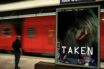
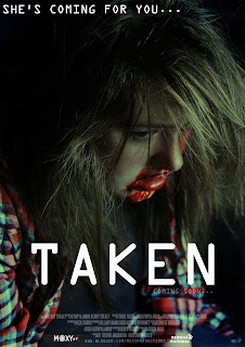
The picture above was illustrated on Photoshop. It is located in an undergrounds station, this is a good location because it gets very busy so often and it can be a popular place for a poster to get a lot of views and advertisement. From viewing this poster here I can now see that the ‘coming soon...’ is not as visible as it should be. It needs to be bolder and maybe bigger. The TAKEN is very visible and stands out; the coming soon should also be the same. ‘She’s coming for you...’ can be seen clearly this is very important as the tag line is what is going to be the phrase that people remember for the film. I don't think that it is important for the credits to be very visible because people generally do not read them anyways. You can see the image clearly and i think that is one of the most important aspects. So over all with this type of advertising i think that the release date or coming soon should be bolder than it is on our poster, because people need to know when it is coming out or coming soon in order to spread the word and get excited about it.


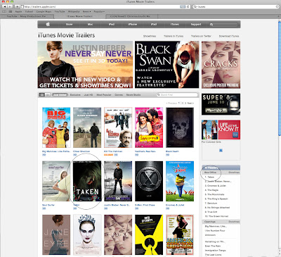
Here we have edited in our film on the Apple Movies website. It is alongside new and upcoming popular film so that would get it seen more and also attract a wider audience. It's next to Justin Biebers Never Say Never and on top of Black Swan; both of these films are very popular but have a completely different target audience. Black Swan would be for older views, 18+ and Justin Bieber would be from a young age onwards. I think that our film poster fits on very well here, as if it wasn't pointed out you cannot tell that it has been edited in. I think that it looks very professional here and is very effective. Being on a web page that has so many posters on it, the posters tend to be very small, so you cannot see any of the smaller writing but you are able to clearly see the title 'TAKEN' and that is because it is written boldly in white. This is a good place for us to advertise our film because it is a very popular website that is updated regularly and would defiantly get our film recognised. Being viewed on this site, the film already looks as if it is going to be good, because this is already such a good site that promote thousands of good films so advertising in a familiar place is always better as audiences always feel more secure in places they know and find comfortable. Also this website is a well known website all over the world so that widens your audience to a mainstream audience all over the world.


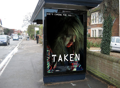
This image is very similar to the one in the train station. Obviously this poster is located at a public bus stop that is used and looked at everyday by many people so it is a very good spot for advertising, however there is the problem of not being able to see the release date of the film and people would defiantly be curious as to when the film is going out. People like information to be fed to them rather than them having to go and search about the film on the internet, so because of this viewers may lose interest. Overall the poster look good in this location and the quality and professionalism looks good just a few font size issues need to be addressed regarding the release date.
When we began our post production research on film promotional material packages we visually saw how it was conventional for continuity to be used throughout each film package we saw. From this is was evident to us that it was an important convention to follow when in the process of designing our own promotional package for our film production. It was logical that we included co notational links between each of our promotional products so that audience members would be able to visually see that the mise en scene used what intentionally used to connotation the horror genre theme, and distinguish that our media package was made for a horror teaser purpose. This was applied in each of our media promotional products by using the same mise en sence of lighting, setting, props, costume and non verbal communication. By using the same mise en scene in each of our products audience members where enabled to visually see the co notational links between each product and indicate that each product had a promotional relation.


Continuity of our product. (Kerry Treacy)
Continuity was also applied in each of our products by using the same graphical and photographic techniques for each media material. This was achieved by using the same design elements and processes in each of our media products. By using the same typography, filters and graphical style we achieved our aim of applying the effect of continuity into each of our products. This can be visually seen in each of our media products of our teaser trailer production, magazine film and film poster promotional material.

Up above are three photographic images which show the promotional products of our film production. Here you will be visually able to see a variety of co notational conventions and repetition of graphical techniques which have been purposely used to formulate our promotional package together. Continuity was used throughout each of our promotional products, this can be visually seen by elements such as the typography. In each product the typography of the title was used in a bold capital font. TAKEN was created with an ocr extended font which we thought was appropriate to fit in with graphical features and photographic style of each of our products. This style of font was also used in our teaser trailer production where audience members where specifically told important details about the villain character of the production.
We used the same colour variation and filter techniques across our media promotional package. This can be visually seen by the use of a light cyan green which featured in a dark manipulated filter created in Adobe Photoshop. By doing this audience members where enabled to see a distinctive relationship between each of the products.
Continuity of mise of scene was used in each of our products. This can be visually seen in the lighting, setting, props, non verbal communication and costume in each of our photographic images we used. In correspondence to photography we decided to use a variation of shots that would connotationally represent the victim character as a vulnerable and weak visual character. This technique of photography was intentionally used to persuade the audience that the actor presented on the promotional material was the victim character. Conventional similarities can be visually seen between the products of our teaser trailer and our photographic work. In the correspondence to our teaser trailer we wanted to use a combination of shots that would conventionally represented the characters as the villain and the victim by film and camera techniques. The use of continuity was a crucial factor to follow when in the process designing our promotional package. This was applied by the use of graphical techniques and software to visually show co notational similarities between all promotional products.


Promoting our product. (Rasheda Miah)
 Before we started to begin our project some of the principles that we learnt when studying Working Title and Warner Brothers was to link our entire products one to another. In other words the continuous use of mis en scene such as: lighting, setting, props, costume and non verbal communication allows audiences’ to see the co-notational link between each of our products. For our ancillary texts (Poster and magazine front cover), the continuity use of a green colour variation and filter techniques across our media promotional package was used yet again to show the relationship between each of the products.


In addition, we kept the costume that the victim character wears in the poster and trailer as well as for the magazine front page. This is so that she looks the same in our entire products. This will allow the audience to recognise and link the products with one another if our project had been a promotion for a real film.


The constant continuity of our products allows itself to create a buzz, for instance if our product is continuously seen on billboards, buses, on the internet, TV or even in magazines, audiences will talk about it to others. Therefore we came up with mocked up illustrations of how our products (i.e. our poster) will look, when promoting our media products by creating promotional material in which audiences can access using a wide range of media platforms. In other words this is known as cross media promotion.
Over the past few years cross media promotion has become an important factor. After a release date is set for a film, distributor’s work towards the materials and the marketing campaign to support and to promote the film. For example, cinema posters are the foundation of theatrical release campaigns, as well as other poster campaigns are considered ranging from underground advertising to billboards. Furthermore, being able to access advance public screenings will also enable to create a word-of-mouth and buzz around a film.
From studying institutions and audiences enabled us to also broaden our knowledge of cross media promotion. ‘The Dark Knight’ is a prime example of a buzz created around the film in which it was promoted for a long period of time before it was released in cinemas. The buzz was created in the production of teaser website tie-ins, release of the soundtrack, Alternate Reality Games (ARG), DVD’s of the previous batman films, toys, poster’s, books, Domino’s promotional pizza boxes, MySpace homepage take over. Also a chocolate company ‘Hershey’ redesigned its packaging to represent the Bat-symbol.

The use of wide range of media platforms attracted many audiences to go keen on the upcoming release of ‘The Dark Knight’. Taking this on board as a group we also imagined how our media product would appear in different formats such as ‘iTunes movie trailers’ as well as tradition media formats.
However, though we created our products as a group we do feel disappointed due to the fact we had a tight time schedule whereby we did not have enough time to offer additional content to extend our audiences experience for our project, like real films does such as ‘The Dark Knight’. However, if we had the opportunity to re-do this project again and have more time we would create a group for our project on Facebook, Twitter, and MySpace in which fans can join and like the group, creating a website for our media package, t-shirt promotion etc.

Evaluation Question 1

In what ways does your media production use, develop or challenge forms and conventions of real media products?
Conventions of a Horror Teaser Trailer. (Rasheda Miah)

Conventions are the customs in which things are followed within the film industry when creating media products such as film, teaser trailers, film posters and film magazine front pages. Form of conventions are used to help the audiences to recognise what specific type of media product it is, and whether they would want to watch it.
After taking a look at many various horror teaser trailers, as a group we also looked at the types of sub genre such as physiological horror. Psychological horror tends to be subtle compared to traditional horror and typically contains less physical harm, as it works mainly on the factors of mentally affecting the audience rather than the display of graphic imagery seen in the slasher and splatter sub-genres.
Many of these horror teaser trailers follow the same conventions, for example, some of the conventions followed are:
The lengths of most real teaser trailers are between 30 seconds up to 60 seconds. For example, the teaser trailer for Paranormal Activity 2 length is 39 seconds and the teaser trailer for Scream 4 is 42 seconds. Screenshots are shown below to show the length of the teaser trailer.
In our teaser trailer we followed the conventions of a horror teaser trailer by keeping the length of our teaser trailer at 40 seconds. This is because we did not want to give too much away to the audience nor did we want to show less. A screenshot of our trailer is shown below illustrating the length of our teaser trailer.
Another convention that was made paramount from watching many real existing teaser trailers was that many of the scenes and shots were very fast paced this was done to help emphasise the tension and suspense of the teaser. Some examples of fast edited teaser trailers we saw are: Rec, The Grudge, saw 3D, Halloween, The Ring, etc. Below are videos of the teaser trailers for Scream and The Grudge.
From looking at these trailers we also decided to follow the conventions of a typical horror film teaser trailer by making our teaser trailer also slightly fast paced in order to make the audience jump and to catch their attention. Another convention we also followed was by including a really quick scene of the villains face at the end of the teaser trailer, to tease the audience and make them jump. We also added a loud diegetic sound to go with the shot both of this idea was followed by looking at the trailer of Rec. A screenshot of our teaser trailer and Rec trailer is shown below illustrating the convention of adding a quick scene to entice the audience.

Another convention that was also noticed in the majority of the teaser trailers that we watched was that many of them did not give away too much of the story line and plot, this is done to prevent too much of the main action being revealed. Yet teaser trailers are kept short but are very effective.
Horror films generally aim to shock, scare, entice and alarm viewers of the factors that play on individuals common fears and present an extraordinary situation. For example, in existing teaser trailers shots of individuals in pain are introduced to ensure the horror representation is implemented. Likewise as a group we decided to follow this convention to entertain the audience. Below are examples from saw 3D and our teaser trailer illustrating how we followed this convention:

Another convention that also seen in many teaser trailers was that in majority of the films the villain was usually males. However, I believe this is a very stereotypical convention that has existed for many years. Examples of male villains seen in existing teaser trailers are: Halloween, Friday the 13th and Nightmare on Elm Street etc.

However, in our teaser trailer we challenged this convention by creating a female character to play the villain role as we did not want the film to be predictable like most horror films. We managed to do this by using a monk suit for the villain in our teaser to wear, in order to prevent the audience from knowing whether the villain is a female or male. An image is shown below on how we managed to not give away what gender of the villain:
By establishing the plot, they let viewers know the setting and know the genre in which the film lays. That’s exactly what we did when we filmed our trailer and we let our viewers know what genre our film is through this convention.

How we used or challenged conventions. (Fergie Nzita)
When is comes to challenging the conventions of teaser trailers, we decided that we was going to introduce our villain. If you notice on many different teaser trailers, villains are mostly unmasked unless it is for example The Dark Knight which is a Batman sequel and many people already know the villains that are in Batman, even so, in the first of two teaser trailers to The Dark Knight, they did not even show the villain. By revealing the villain it could be an advantage because people might be interested in the villains appearance and intrigued by their problem. However it could all backfire as revealing the villain might just let the audience and viewers already know what is going on so what is the point. On the other hand we believe by challenging the convention and revealing our villain in a teaser trailer, we could possibly achieve a fanbase for our villain for example the same effect The Dark Knight had in terms of good vs evil which manages to create a bigger audience and base for our “film” as this is only the teaser trailer and there is more to come. 

Conventions of a Horror Poster. (Olympia Amoo)
There are many things thats connote a horror poster, these conventions enable the audience to be able to recognise a film of this genre without even knowing about it. There are many conventions but there are some key ones that are used most commonly; these are, low key lighting (dark photo), large title, bold fonts and colours and of course the victim on the front, usually injured and a female, if the villain is on the poster they will normally be holding a weapon of some kind or just look 'evil'. For example 'Halloween' has the villain on the poster with a cover with a knife in his hand, this clearly indicates he is dangerous and the 'killer' in the film. Also by having him on the front cover shows that he is the main character and that the film will be following his life. Also in a conventional poster dark images are used but not with all posters as you can see with the poster on the right, the background is completely white and you can slightly see a house in the background, this automatically establishes the setting; the reason for the white background is to make him stand out more because he is in black and also the knife is held over his clothes so it stands out over the black.
Other conventions of a horror poster is a phrase or a tag line, this is something that allows people to remember the film. A lot of films use this, but not all. Example of films that have used this convention is 'Orphan', 'An American haunting' and 'Last house on the left'. The phrases are a very important part of the poster as it catches you in, and other than the image on the front it is the only thing that really tells you what the film is about. An example of phrases used: 'If bad people hurt someone you love, how far would you go to hurt them back?' this is so effective as it gives you an idea of what happens and then makes you think 'how far would you go?' and it intrigues the audience to watch it because they wanna see how far they go.


For our poster we did follow some conventions of a horror film trailer. For example, on the right hand side you can see a professional poster for the film 'REC' this poster has many horror film conventions, for example it is very dark and the background is completely black. Looking at our poster you can see how we have followed that convention, the background is all blacked out connoting fear and horror. The title on our poster is white because it stands out against the dark background, this is also evident in 'REC' the colour white is used and also red, this is also because the 'record' button on a camera is red. If you compare our poster to this professional one, we have followed the conventions closely.
We have used the steel tongs font that is used on all posters for the credits. Another convention that we followed was using a tag line that represents our film 'she's coming for you...'; the use of ellipsis also adds tension and suspense to the poster. The photograph of the victim on the front injured is also a convention of a horror poster, the fact that the victim is white and female also adds to the stereotype of a horror poster. The listed film companies and website underneath the credits are also a convention.
Our poster has followed some conventions of a teaser trailer and left out some others. I think that the use if the conventions that we used makes are poster look professional and real.

Conventions of a horror magazine. (Kerry Treacy)

It was an important factor that we as a group produced a magazine front cover as part of one of our three media products for our media package. We decided as a group to use a conventional way of advertising and use a traditional method to advertise and promote our media product to audience members. The purpose of the magazine front cover was to create the awareness of our media products which included a teaser trailer production, movie poster and a magazine front cover all of which worked together to promote our main media product “TAKEN“. All three products were made to work together and promote our Teaser trailer.
The third product that we created was the magazine front cover which promoted our main product the teaser trailer production of “TAKEN“. When in the process of designing and developing our ideas for our movie magazine. It was an important factor to do post production research into the conventions and the production of a movie magazine. From the early stages of our post production research each individual member of our group produced a textual analysis on a movie magazine product.


The intention and purpose for doing this was to visually see how professional Graphic Designers use specific design techniques to fit in with the conventions of successfully distinguishing to the audience that the product that they are being presented with is a movie magazine. From our textual analysis we individually saw the importance of how the appliance of how typography and photographic work was crucial in the way designers applied conventions and professionally constructed graphical and extra design elements to make the product look professional and persuasive to a consumer market audience.

Down below is a photographic image which demonstrates visually how we used and applied the conventions of a movie magazine. It was a crucial and important factor that we followed the conventions of the professional media product so we could distinguish to audiences that the product they are being presented with is a Film magazine.
The image on the right visually demonstrates the conventions that we applied and used. We decided as a group to follow the conventions of the Empire film magazine cover featured in the image up above. We thought it was most appropriate from our own visual perspective to fit the layout of our photographic image. The image above features four annotations which visually show what conventions we used for our media product. The first annotation points out how we used the convention of sub headlines. On our magazine front cover we featured the use of, exclusives, verdicts, wowser and surrogates. These were conventionally used to persuade our target consumer audience to view our media product. The second annotation points out how we used the use of a masthead. This was conventionally used to distinguish to our audience members that the product they are being visualised with is a magazine front cover, and also communicates to the audience the name of the product. The third annotation points out how we conventionally used the se of a barcode. This was another important convention to use as it was specifically used to communicate to the audience the price of the product. The fourth annotation points out how we used a main headline. This was used as the feature on the movie magazine that would distinguish to audience that the main feature in the product was our production of TAKEN.

We used all of the above conventions as a set of rules that would enable use to successfully design a film cover magazine product that would distinguish to audience members that the product they were being presented with was a film magazine cover. We as a group decided to follow all the conventions of a professional magazine cover and not challenge or break the conventions as it may have brought about negative and unsuccessful effects into audience members feedback.

In the correspondence to our photography for our magazine front cover we as a group thought it was an important factor to include the process of continuity. This was a crucial factor to use as a convention as it would enable audience members to link all of our media products together.

On the left is a photographic image which visually shows both of our print made promotional material to advertise our main media product of our teaser trailer TAKEN. In correspondence to the use of continuity we used the same conventions on both our magazine front cover and our film poster to visually establish to audience members that both products have a relation to each other. We used specific factors such as mise en scene between both products to establish that the product was of the horror genre, and had a connection with the other promotional material. We used factors such as low key lighting, specific make up to convey and give a visual representation of the victim and a variety of graphical techniques that would give the overall effects and completion of the magazine front cover to make it professional.