How effective is the combination of your main product and ancillary texts?
Production. (Fergie Nzita)
Throughout the production of our teaser trailer, poster and magazine cover, we established that by creating a theme that includes the same texts, font and colours, it would help possible viewers and fans to be able to identify where the products are coming from, what the influences are and any promotions that we may have.
Our magazine front cover, our poster and our teaser trailer all have the same fonts. These fonts allow for people to piece together our work. It also goes with our theme which is a mission impossible type theme with the military opaque green that is illustrated in our poster and magazine front cover and the computerized font of writing that we had used. It is always important for the magazine to use similar or more over exactly the same type of font and theme that is portrayed in the film advertisements and poster. That way, it doesn’t confuse anything.
The opaque green and computerized text is used very effectively in our work. This is because the shade is dark and see through therefore using other dark colours like black and grey becomes easier to include as they also fall into the same theme. For example, the typical colours and shades on an army uniform is black, green and grey, so by contributing these colours as 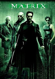
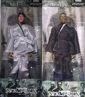 mains in our colour themes, we were able to establish a perfect colour topic that would work well with our teaser trailer and advertising.
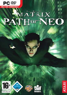

 mains in our colour themes, we were able to establish a perfect colour topic that would work well with our teaser trailer and advertising.
If you notice, on all advertisement and products on offer for the Matrix film prior and after its release, it includes a similar theme to ours from the green to the writing which is computerized. If you have watched the film you would know why this is portrayed.
In the images, the colours and font are all the same, therefore it allows for its consumers to know where they are coming from and happily purchase it.
When importing this theme and the colours into our teaser trailer, most of it was done through our editing process on photoshop. We created a dark shade on green and made it opaque. This was done for the poster and also for the magazine cover. In terms of the trailer, we introduced a shade of grey that gave our teaser trailer a musky effect, also adding successfully to our teaser trailer.
What we thought worked extremely well in terms of the theme is that the costume of our victim who takes the centre stage in our media production is that, her costume shirt was red with blue strips. This allowed us to portray a more normal side, that our victim is just a normal person. If we had given our victim a costume, the same colours as the theme, it would look it a bit too much and a bit too extra. By allowing her to look different to everything, it is as though she has been brought into this whole situation unwillingly. However, we managed to introduce the same clothes she wears in the trailer into the poster and magazine cover.
The connection that all three of these products looking similar is that it creates a buzz between our possible audiences. This buzz obviously brings more people to want to watch our “film” and therefore hopefully making the film a success.
Advertising our products. (Olympia Amoo)
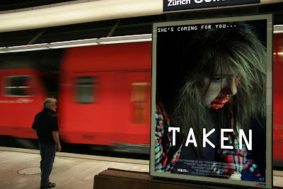
The picture above was illustrated on Photoshop. It is located in an undergrounds station, this is a good location because it gets very busy so often and it can be a popular place for a poster to get a lot of views and advertisement. From viewing this poster here I can now see that the ‘coming soon...’ is not as visible as it should be. It needs to be bolder and maybe bigger. The TAKEN is very visible and stands out; the coming soon should also be the same. ‘She’s coming for you...’ can be seen clearly this is very important as the tag line is what is going to be the phrase that people remember for the film. I don't think that it is important for the credits to be very visible because people generally do not read them anyways. You can see the image clearly and i think that is one of the most important aspects. So over all with this type of advertising i think that the release date or coming soon should be bolder than it is on our poster, because people need to know when it is coming out or coming soon in order to spread the word and get excited about it.
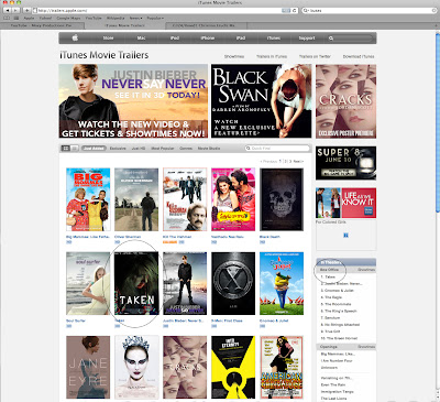
Here we have edited in our film on the Apple Movies website. It is alongside new and upcoming popular film so that would get it seen more and also attract a wider audience. It's next to Justin Biebers Never Say Never and on top of Black Swan; both of these films are very popular but have a completely different target audience. Black Swan would be for older views, 18+ and Justin Bieber would be from a young age onwards. I think that our film poster fits on very well here, as if it wasn't pointed out you cannot tell that it has been edited in. I think that it looks very professional here and is very effective. Being on a web page that has so many posters on it, the posters tend to be very small, so you cannot see any of the smaller writing but you are able to clearly see the title 'TAKEN' and that is because it is written boldly in white. This is a good place for us to advertise our film because it is a very popular website that is updated regularly and would defiantly get our film recognised. Being viewed on this site, the film already looks as if it is going to be good, because this is already such a good site that promote thousands of good films so advertising in a familiar place is always better as audiences always feel more secure in places they know and find comfortable. Also this website is a well known website all over the world so that widens your audience to a mainstream audience all over the world.
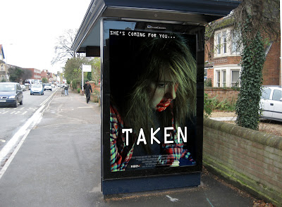
This image is very similar to the one in the train station. Obviously this poster is located at a public bus stop that is used and looked at everyday by many people so it is a very good spot for advertising, however there is the problem of not being able to see the release date of the film and people would defiantly be curious as to when the film is going out. People like information to be fed to them rather than them having to go and search about the film on the internet, so because of this viewers may lose interest. Overall the poster look good in this location and the quality and professionalism looks good just a few font size issues need to be addressed regarding the release date.
When we began our post production research on film promotional material packages we visually saw how it was conventional for continuity to be used throughout each film package we saw. From this is was evident to us that it was an important convention to follow when in the process of designing our own promotional package for our film production. It was logical that we included co notational links between each of our promotional products so that audience members would be able to visually see that the mise en scene used what intentionally used to connotation the horror genre theme, and distinguish that our media package was made for a horror teaser purpose. This was applied in each of our media promotional products by using the same mise en sence of lighting, setting, props, costume and non verbal communication. By using the same mise en scene in each of our products audience members where enabled to visually see the co notational links between each product and indicate that each product had a promotional relation.
Continuity of our product. (Kerry Treacy)
Continuity was also applied in each of our products by using the same graphical and photographic techniques for each media material. This was achieved by using the same design elements and processes in each of our media products. By using the same typography, filters and graphical style we achieved our aim of applying the effect of continuity into each of our products. This can be visually seen in each of our media products of our teaser trailer production, magazine film and film poster promotional material.
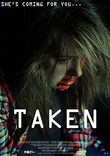
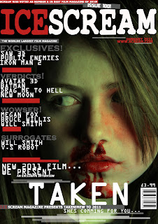
Up above are three photographic images which show the promotional products of our film production. Here you will be visually able to see a variety of co notational conventions and repetition of graphical techniques which have been purposely used to formulate our promotional package together. Continuity was used throughout each of our promotional products, this can be visually seen by elements such as the typography. In each product the typography of the title was used in a bold capital font. TAKEN was created with an ocr extended font which we thought was appropriate to fit in with graphical features and photographic style of each of our products. This style of font was also used in our teaser trailer production where audience members where specifically told important details about the villain character of the production.
We used the same colour variation and filter techniques across our media promotional package. This can be visually seen by the use of a light cyan green which featured in a dark manipulated filter created in Adobe Photoshop. By doing this audience members where enabled to see a distinctive relationship between each of the products.


Continuity of mise of scene was used in each of our products. This can be visually seen in the lighting, setting, props, non verbal communication and costume in each of our photographic images we used. In correspondence to photography we decided to use a variation of shots that would connotationally represent the victim character as a vulnerable and weak visual character. This technique of photography was intentionally used to persuade the audience that the actor presented on the promotional material was the victim character. Conventional similarities can be visually seen between the products of our teaser trailer and our photographic work. In the correspondence to our teaser trailer we wanted to use a combination of shots that would conventionally represented the characters as the villain and the victim by film and camera techniques. The use of continuity was a crucial factor to follow when in the process designing our promotional package. This was applied by the use of graphical techniques and software to visually show co notational similarities between all promotional products.
Promoting our product. (Rasheda Miah)
Before we started to begin our project some of the principles that we learnt when studying Working Title and Warner Brothers was to link our entire products one to another. In other words the continuous use of mis en scene such as: lighting, setting, props, costume and non verbal communication allows audiences’ to see the co-notational link between each of our products. For our ancillary texts (Poster and magazine front cover), the continuity use of a green colour variation and filter techniques across our media promotional package was used yet again to show the relationship between each of the products.
In addition, we kept the costume that the victim character wears in the poster and trailer as well as for the magazine front page. This is so that she looks the same in our entire products. This will allow the audience to recognise and link the products with one another if our project had been a promotion for a real film.
The constant continuity of our products allows itself to create a buzz, for instance if our product is continuously seen on billboards, buses, on the internet, TV or even in magazines, audiences will talk about it to others. Therefore we came up with mocked up illustrations of how our products (i.e. our poster) will look, when promoting our media products by creating promotional material in which audiences can access using a wide range of media platforms. In other words this is known as cross media promotion.
Over the past few years cross media promotion has become an important factor. After a release date is set for a film, distributor’s work towards the materials and the marketing campaign to support and to promote the film. For example, cinema posters are the foundation of theatrical release campaigns, as well as other poster campaigns are considered ranging from underground advertising to billboards. Furthermore, being able to access advance public screenings will also enable to create a word-of-mouth and buzz around a film.
From studying institutions and audiences enabled us to also broaden our knowledge of cross media promotion. ‘The Dark Knight’ is a prime example of a buzz created around the film in which it was promoted for a long period of time before it was released in cinemas. The buzz was created in the production of teaser website tie-ins, release of the soundtrack, Alternate Reality Games (ARG), DVD’s of the previous batman films, toys, poster’s, books, Domino’s promotional pizza boxes, MySpace homepage take over. Also a chocolate company ‘Hershey’ redesigned its packaging to represent the Bat-symbol.
The use of wide range of media platforms attracted many audiences to go keen on the upcoming release of ‘The Dark Knight’. Taking this on board as a group we also imagined how our media product would appear in different formats such as ‘iTunes movie trailers’ as well as tradition media formats.
However, though we created our products as a group we do feel disappointed due to the fact we had a tight time schedule whereby we did not have enough time to offer additional content to extend our audiences experience for our project, like real films does such as ‘The Dark Knight’. However, if we had the opportunity to re-do this project again and have more time we would create a group for our project on Facebook, Twitter, and MySpace in which fans can join and like the group, creating a website for our media package, t-shirt promotion etc.

No comments:
Post a Comment